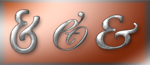
Look at these three ampersands.
Each conveys a distinct style, mood and message.
Choosing type that appropriately matches and reinforces a company’s intended message is part art, part science. A well designed logotype (a type based logo) blends subliminal and overt messages through the use fonts, size, color, shape and position. Logotypes done right embody congruence and connection with the essence of what is unique about a company.
Type and logos are not “one size fits all.” Each has nuance, energy, emotion.
Clarity, communication, and connection to your audience are critical criteria when selecting the elements to be used in a visual representation of your company.
I discovered an excellent article about the elements to consider when developing a text based logo. This article has beautifully illustrated examples and narrative. I highly recommend reading it if you love type or if you are thinking about creating a new business image. You can find it here: Creating a Logotype Depends More on the Means Than the End | Webdesigner Depot
Type loving graphic designers will enjoy the article and may use it as great starting point for a discussion with a client.
Those who purchase design services will get a glimpse of the design process and the considerations that go into a well designed logo.
The language of design made transparent.
If you love amerpsands like I do, here is another blog for you to visit.


You must log in to post a comment.